Twenty-one days, two gyms, two languages
The brief was less information, straight to booking, and a page that looks like the gym's best work. Everything on it either moves a visitor toward a booked first workout or was cut.
- Role
- Designer & developer
- Locations
- Huntington Beach, Whittier
- Languages
- English, Spanish
- Stack
- Static + serverless
The brief
The next offer after the six-week challenge: twenty-one days, starting on a fixed Monday, with registration closing on day four. The direction was short: hero, booking, member photos, footer. Less information, straight to booking, and a page that looks like the gym's best work rather than a form.
A deadline you can see
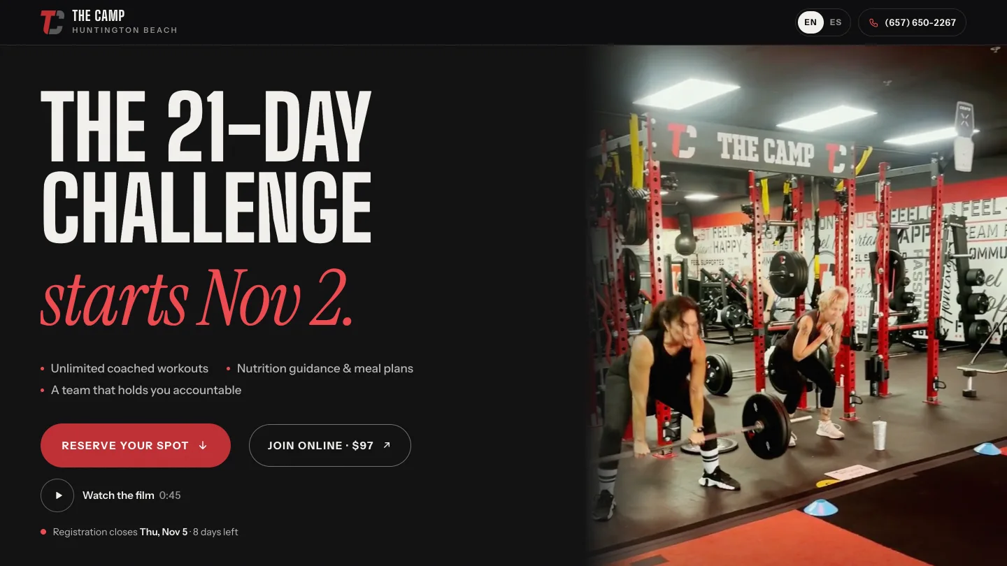
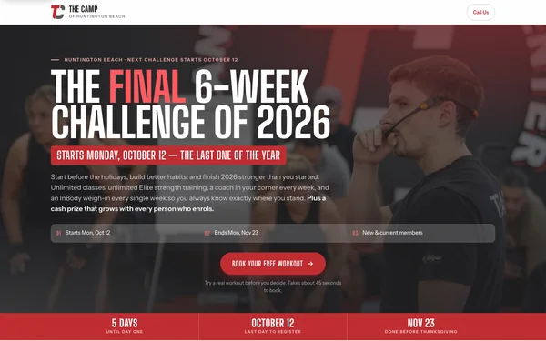
- Real footage. The Huntington Beach hero is a loop of an actual class, so the first thing a visitor sees is the room they would walk into.
- The challenge as a timeline. Twenty-one ticks, one per day, with the registration cut-off flagged on day four and a live count of the days left to sign up.
- Two calls to action, ranked. Reserve your spot books a first workout and leads. At Huntington Beach, Join online at $97 is the second option for people who have already decided, and it disappears when registration closes.
Booking that already worked
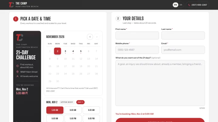
Rather than design a new form, the page reuses the scheduler from the six-week challenge: a month calendar that marks the days with classes, the challenge's first day labelled, and that day's class times one tap away. The booking engine underneath is the one behind the earlier campaigns, with its emails reworded for this offer.
English and Spanish, end to end
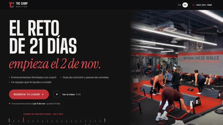
A switch in the header changes the whole page, and the Spanish version has its own link to share. Phones set to Spanish open in Spanish, and the choice is remembered. A booking made in Spanish gets its confirmation email and calendar invite in Spanish; the team's copy stays in English, flagged so the front desk knows which language to reply in.
A second gym, with its own pictures
Whittier got the same page pointed at its own address, phone number, class times, inbox and booking sheet, and only its own photography. Its one usable video had text over nearly every frame, so its hero is a still rather than footage borrowed from the other gym.
Restraint as the design
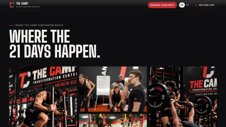
An earlier booking page for these gyms read as a form rather than a brand. This one starts from what fixed that: a dark frame around a light booking section, crisp real photography, few words, and motion only where it earns its place. On phones the photo comes first with the headline on its lower edge, and the calendar sits within a thumb's reach instead of two screens down.
The half that is not a website
Each gym got QR codes for the front desk and a seven-page team playbook, including what to do when someone pays online before they have ever walked in.
More screens
Next case/The Camp
One funnel engine, five campaigns